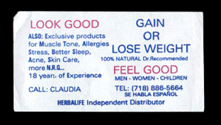


Look Good Claudia This is another hugely popular type. The 'Look Good - Feel Good' axis is repeated on dozens of different diet ads and the one you see here is likely one of the knock-offs. Found early August 1998. I have a special fondness for this Claudia version (Claudia has a few others, see Related Adverts) because of its typographic liberties. The sans-serif font looks fairly fresh in the blue and red and the capricious capitalization is keen. Finally, the empty acronym "N.R.G." (representing 'energy') steals the show for space-saving pseudo-scientific hipness.